In trading, every second counts — an intuitive and efficient user experience makes all the difference.
DEGIRO, Europe’s leading online broker, asked for help modernizing their trading platform. While the service was performing well, the interface felt outdated and no longer reflected the brand’s success. They wanted a refreshed experience with a more intuitive design, new features, and the addition of sound design—without disrupting what loyal users already knew.

What began as a three-month engagement grew into a creative partnership that helped shape DEGIRO’s future.
The initial scope centered around three foundational phases: art direction, production, and delivery. This laid the groundwork with a bold new art direction and a refined component library powered by design tokens. As momentum grew, so did the ambition.
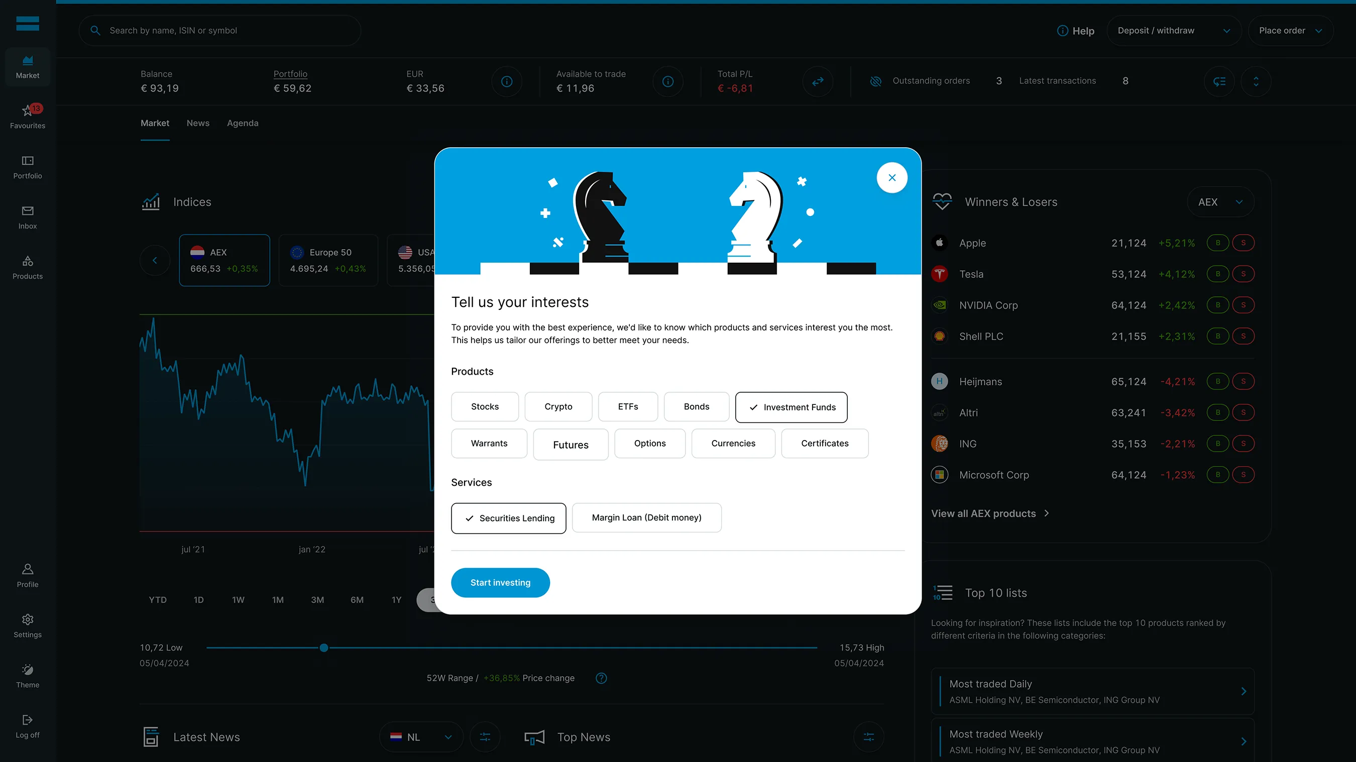
The project evolved into a broader scope—designing features like crypto, AI, personalization, and UX sounds to shape a more future-ready trading experience. Accessibility remained a core priority throughout, aligning the platform with 2025 EU regulations.
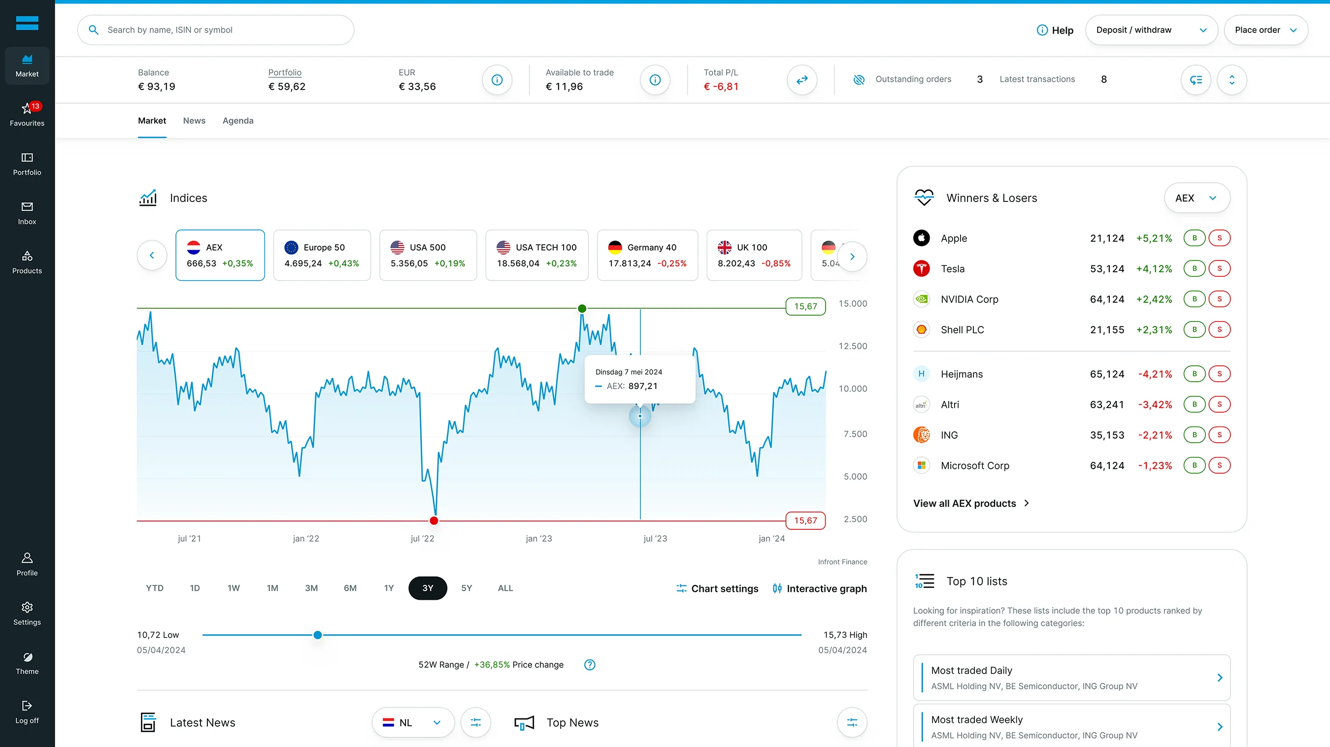
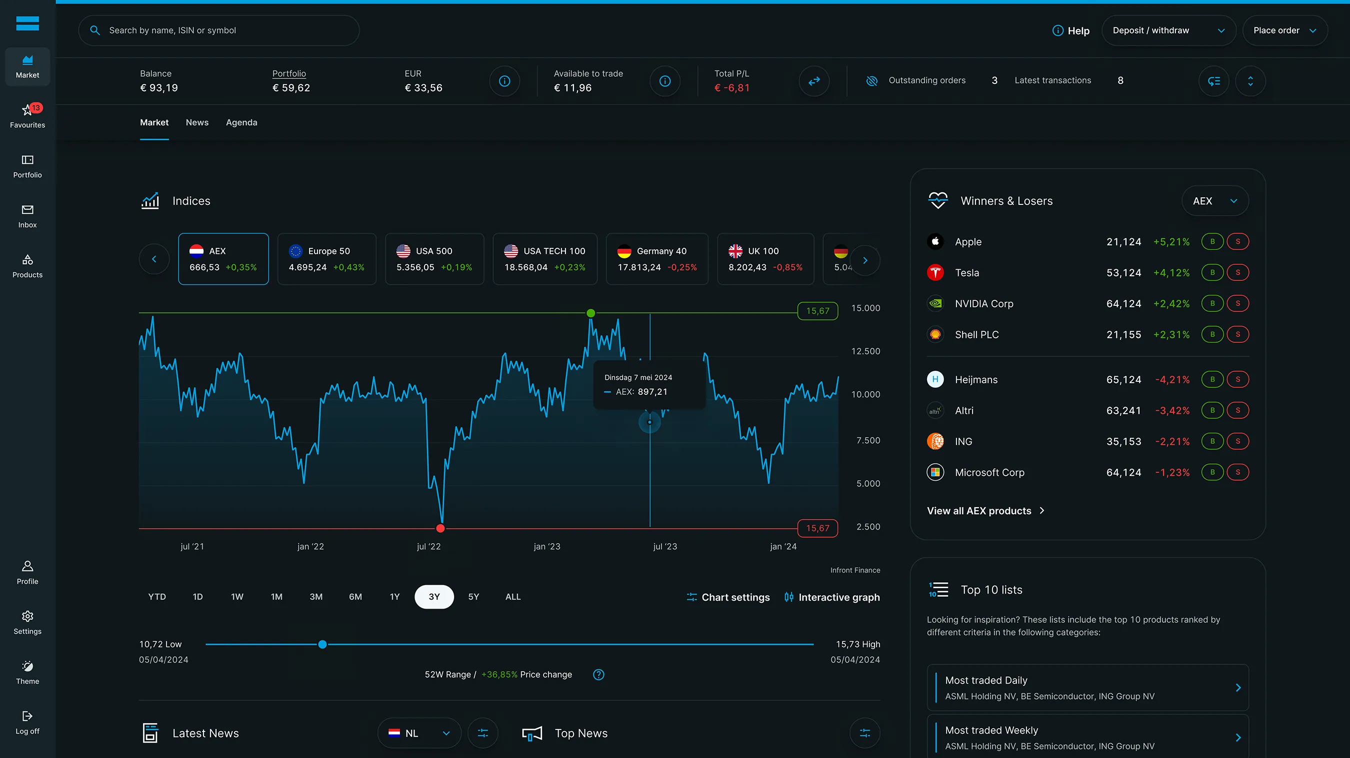
The foundation was set by auditing and mapping the platform into a clear information architecture.
To lay the foundation for a more scalable and intuitive platform, the process began with mapping features, components, and user flows—starting with a comprehensive audit of existing templates, structures, and naming conventions. These insights shaped the new information architecture and sitemap, clarifying what to keep, refine, or reinvent.


The interface is the brand — every interaction is a reflection of its identity.
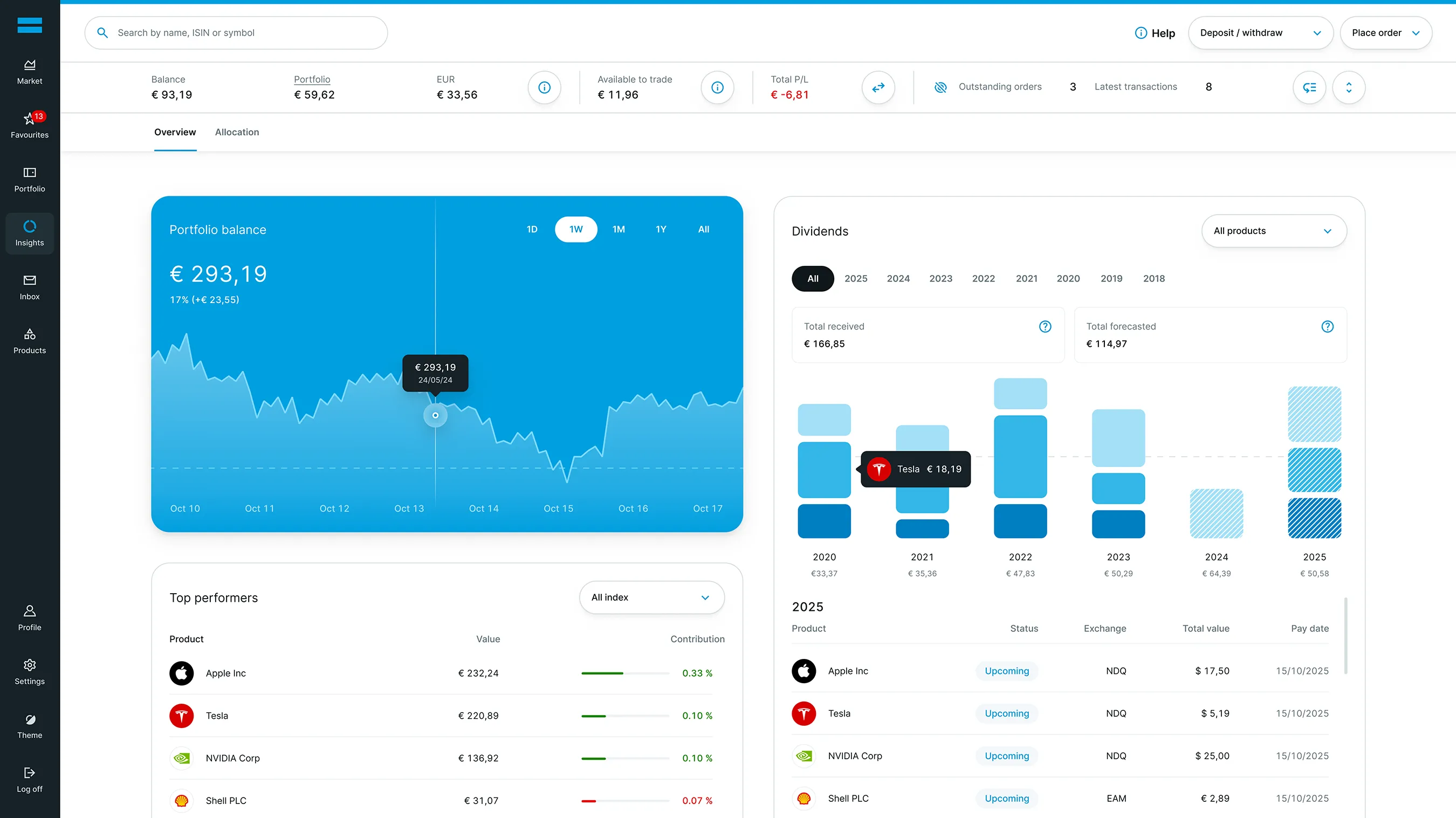
Visual explorations transformed DEGIRO’s interface into a more expressive and intuitive experience—expanding the brand palette to signal interactivity and using elevation to guide focus, create hierarchy, and bring depth to every interaction.
Breaking the mold comes with resistance.
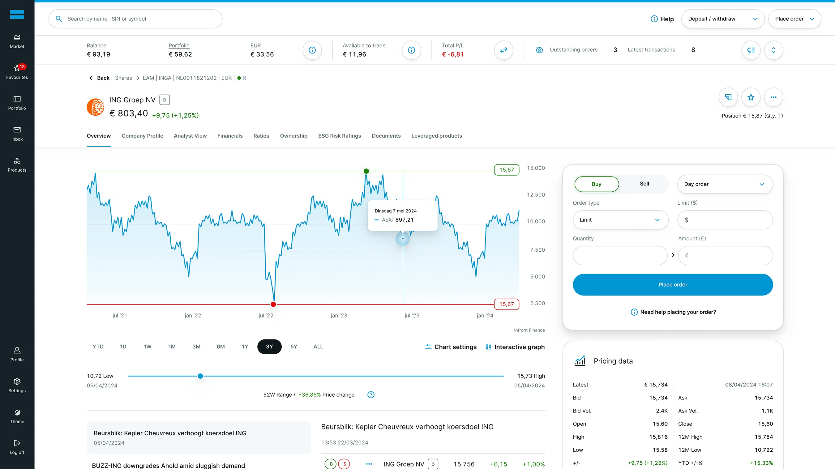
A group of DEGIRO customers tested early design updates. Changing the buy and sell buttons from red and green to blue and black improved visual consistency, but feedback showed a strong preference for the traditional colors. Red and green accents were reintroduced to preserve familiarity while supporting the updated visual identity.
Designing a modular component library powered by design tokens and accesbillity.
Over six weeks, a robust set of modular components was designed to serve the platform’s seven key templates—laying the groundwork for a scalable design system. This modular approach enabled each component to adapt across layouts, color modes, and device types, setting the stage for a truly flexible and future-proof interface.
A flexible token system was built from the initial art direction, creating a shared foundation for designers and developers. It included core and semantic tokens—covering color, typography, spacing, and motion—to ensure consistency, speed, and a more dynamic user experience.


All components, from the smallest atoms to full-page structures, were unified into a scalable library—establishing the foundation for a cohesive and future-ready platform. The integration of motion brought the interface to life, adding clarity, warmth, and a sense of purpose to every interaction

From idea to execution—true impact begins with deep collaboration.
Five weeks of dedicated development support ensured every component was built with precision and aligned across design and development. To guarantee accessibility, an external audit was conducted, leading to key refinements that made the platform more inclusive and future-ready.
%20copy.webp)
A set of two branded UX sounds was created — one for Trade Placement and one for Trade Execution.
The sounds were designed to work both on their own and together, following each other seamlessly when those moments happen back-to-back. The sounds are unique to the platform, digital, but with a human and friendly feel by adding subtle layers of instrumentation. On top of that, a clear set of guidelines was created to explain how the sounds were built and which design principles apply.

Placing a trade requires speed and certainty. This sound confirms the action instantly, adding precision and reducing hesitation—making the experience feel faster, clearer, and more controlled.

When a trade is executed, timing is everything. This sound provides a clear and immediate signal, ensuring users never miss a completed action—even when their attention is elsewhere.
Careful observation helped identify where sound could add value — moments where visuals alone weren’t enough.
Subtle audio cues could reduce cognitive load and keep users engaged. The sounds needed to be functional, accessible, and add emotion to strengthen the connection with the platform.
A motif was defined: something that felt on-brand, set the right tone, and allowed both sounds to work together as a unified system. The missing piece was a human touch. An acoustic approach was taken by layering a digital tone over soft piano, resulting in a sound that feels both distinct and deeply human.


